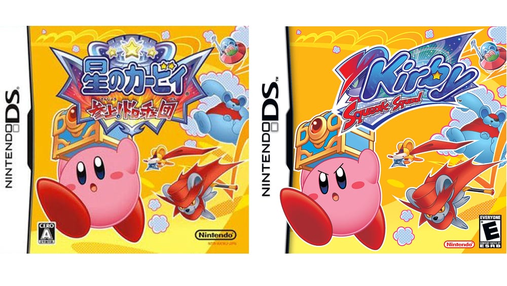
Kirby is a pretty cool character, essentially he is an almost unstoppable pink blob that has a stomach that can’t be tamed. Though while cute and fascinating have you ever wondered why when you see box arts for the games Kirby looks angry in America and yet look cute in Japan. It is actually pretty interesting.
Kirby Triple Deluxe director Shinya Kumazaki explained to GameSpot:
For the Japanese versions we are, at [Kirby series developer] HAL, involved in everything throughout development, including the package design. The most powerful image of Kirby is that cute image, we think that’s the one that appeals to the widest audience.
While it does start cute, we know there is a serious side to Kirby as well, and throughout the gameplay we see more and more of that, and the games themselves have quite a bit of depth. That being said, we recognise that Kirby’s cuteness is his biggest draw in [the Japanese] market.
Kumazaki then added that Nintendo of America handles thing in North America, they provide HAL with insight into the market relating to what will appeal to consumers more.
What we have heard is that strong, tough Kirby that’s really battling hard is a more appealing sign of Kirby, so that’s what we feature in the US.
Given the countries I have always thought the way they do specific things is better and for the Kirby box art we know this is true. In most areas the sight of anger in Kirby’s face says power and makes you think okay this could be interesting, in Japan the whole cute look works as people seem to like cute thing in Japan and Kirby is pretty cute.
Source: Gamespot