Remember when video game covers used to be cool? A further expression of what the video game is all about. However, video games recently have sort of become a tad lazy. No more artistic visions that summarizes what the game is about in one image, now they just throw an image of the protagonist holding a weapon with either his back turned or front facing us. So as standard with the internet, here’s a list where I rank them from bad to worst.
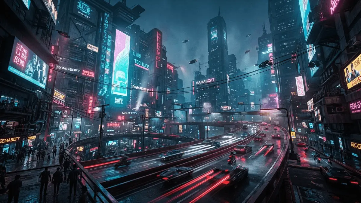
10: Cyberpunk 2077

Cyberpunk 2077 comes in last as the least offensive game cover for me. Mainly because this game isn’t out yet. There’s always a small chance that this might not actually be the final box art for the game. I do like the yellow background; it makes the image more striking but that’s about it. If this is the final box art, then I’m gonna be disappointed. Cyberpunk 2077 promises a massive futuristic dystopian world that I’ll bet my house on will be a blast to play around in. With such a cool setting for the game, why choose the standard go-to action cover of the protagonist front and center holding a weapon? Let’s hope it changes.
9: Call of Duty: Modern Warfare 3

Nearly every single Call of Duty game has pretty much the same cover art. Modern Warfare 3 however takes the cake as the laziest because they didn’t even try to design a background for the character. Every Call of Duty game has a character holding a gun on the cover, but at least they have tried to add something in the background. This one is just white. A plain white background. Nothing to it, just pure laziness, and it doesn’t even look good. This doesn’t make it any higher on the list simply because of how similar this cover is to other Call of Duty covers, just this one is the worst out of the bunch.
8: Destiny

To be fair to Destiny, they vastly improved their cover with their sequel. That still doesn’t absolve this boring excuse of a cover. Why Bungie thought the best way to entice people to play their brand new IP was by showing a few character with their backs turned I’ll never know. It doesn’t look exciting, there’s nothing really going on, and it doesn’t make me want to buy the game. It’s a big downgrade from Bungie’s Halo covers, which were actually visually exciting.
7: Crysis 3

The reason I’ve chosen Crysis 3 over the other Crysis games (apart from one that’s yet to make the list) are for two simple reasons: one reason is because Crysis and Crysis 2 have essentially the same cover but showed each game’s settings well. Crysis showed off the jungle setting and Crysis 2 showed off the city setting. Crysis 3 shows nothing. You get a slight hint of the setting, but it’s so transparent that I don’t know why they didn’t just use a white background. The other reason is, Crysis 3 is terrible and hurt my soul to play after loving the first two games. Nothing to do with the cover, I just still haven’t forgiven it.
6: Dead Space 3

You know what’s scary? A severed hand floating in space all alone aside from the debris of a destroyed space station. You know what isn’t scary? An image of Isaac staring right at us holding a weapon in front of a plain white background. This one annoys me because the protagonist of Dead Space, Isaac, is not an action hero. Ever since the first Dead Space, the sequels became more and more action-focused, and this cover should alone tell you that Dead Space 3 has shifted massively into the action side of things. The game was terrible anyway, so you’re not missing much if you haven’t played it.
5: Crysis Warhead

Yes, Crysis again. This game is on here mostly because I believe this was one of the first games to use this format for a cover. Crysis Warhead was released in 2008 and most of the games on this list came out after this, therefore in my eyes this game is one of the causes of all the boring covers. It’s not higher on the list simply because, it’s not the ugliest cover and there’s way more pure lazy covers out there for me to complain about.
4: Uncharted: Drake’s Fortune

Hot take, Uncharted: Drake’s Fortune is the weakest Uncharted game. Now that doesn’t really have anything to do with the cover of the game, I just wanted to get it out there. Thankfully, this cover isn’t used in the European version of the game, so my eyes never had to suffer looking at the back of Nate whilst he stares off into the distance. I only found this cover whilst researching for this article. I think I’ll stick with the European cover of the game for when I ever decide to just take the game out and stare at the case.
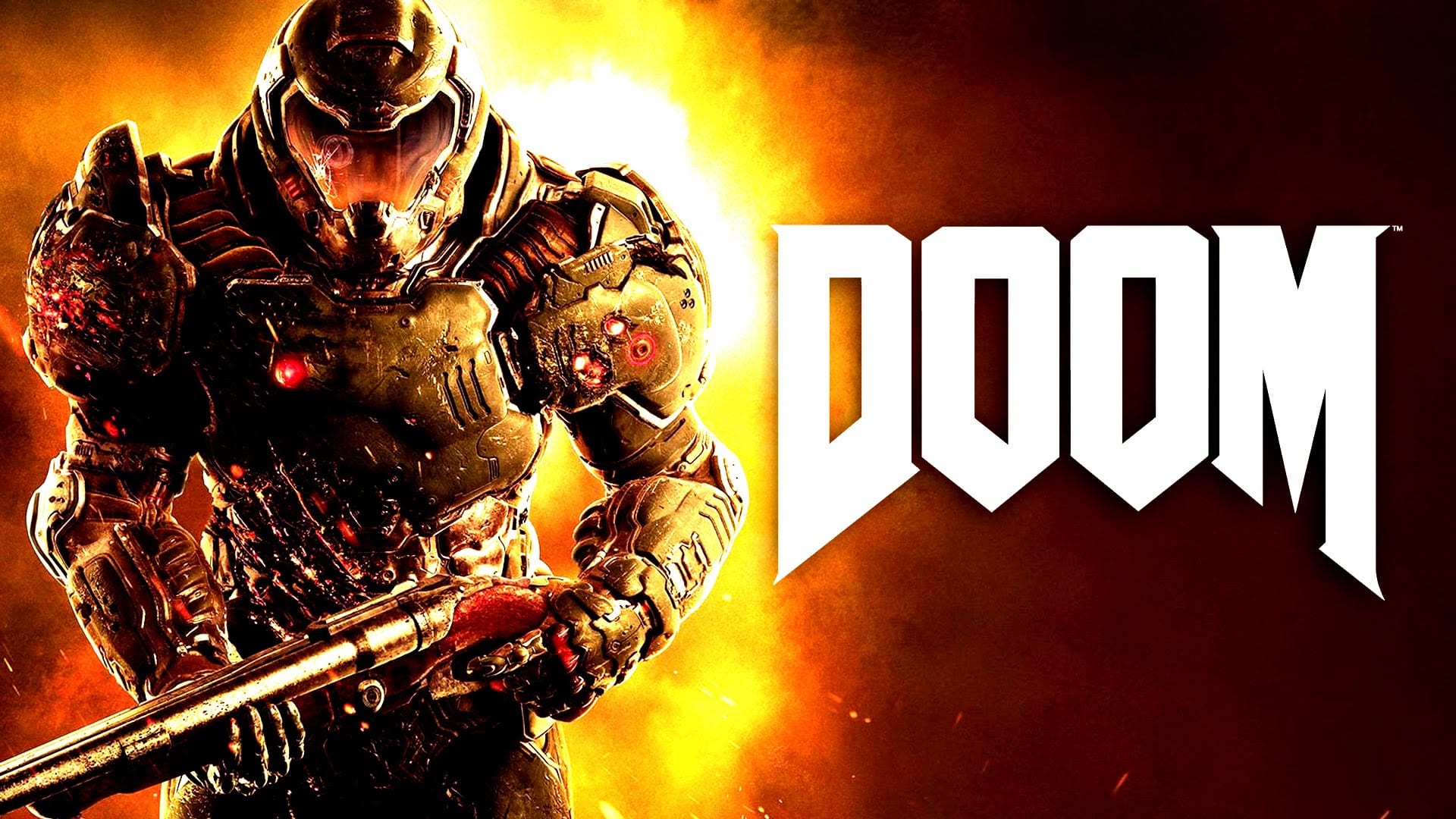
3: Doom

This cover is ugly as sin. It tells you nothing about the game you’re about to play other than there’s a man with a gun and you will probably play as him. This whole thing is rectified slightly with the reversible cover, which is a homage to the original Doom cover, and they used it as the official cover for the Switch version. Why the reversible cover wasn’t used as the official cover for the Xbox One and PS4 version of the game I do not know. It has style, attitude, and perfectly shows what the game is about with Doom Guy fighting off hordes of demons. The official cover is just Doom Guy holding a gun. Meh.
2: Bloodborne

Bloodborne is one of the most beautifully dark and atmospheric games of this generation. You know what would really sell that? The back of the protagonist… holding weapons… on a white background. They tried to play around with it by adding in a bit of what you can expect from Yharnam on the bottom half of the protagonist but it’s not enough. What confuses me about it is the Dark Souls games don’t have this problem. Those covers perfectly build the atmosphere for what you can expect in those games. Bloodborne does not. It feels like a launch game cover for the PS4.
1: Bioshock Infinite

In the number one spot, the cover that annoys me the most for being pure lazy and does not represent the game at all: Bioshock Infinite. I love the Bioshock games a lot. The atmosphere that every game builds up, the story behind every location, the tragic backstory of the inhabitants of Rapture, and (to a certain extent) Columbia and the exploratory nature of how you play and traverse the world is just a few reasons why I love these games. This cover, however, is trash. It makes Bioshock look like a run-of-the-mill action shooter game. It looks like Uncharted: Drake’s Fortune. This game is nothing like Uncharted yet it makes you want to believe it is. That’s my biggest problem with all of this. All of these games are pretty different from each other but the cover art makes you believe that they’re all the same. Thankfully I wouldn’t say that cover art is dead. There’s still amazing work being done, like The Outer Worlds.
GameLuster’s Tuesday 10 highlights memorable, light-hearted facets of video games or the industry at large. The No. 1 is a hill no one should die on, but it’s a hill that should be admired from afar.